Retrofitting a redundant industrial building into an iconic gallery
Grain Silo Complex
Originally built in the 1920s, the Grain Silo was a thriving grain storage hub in Cape Town and, at the time, it stood as the tallest building in Sub-Saharan Africa. However, by the turn of the century, the building was abandoned and left in disrepair as grain exports quickly declined.
Rather than demolishing the Grain Silo, V&A Waterfront saw the building’s historic significance and unique aesthetics as an opportunity and acted to make it the centrepiece of the newly rejuvenated Silo District. In collaboration with Heatherwick Studio, we worked with V&A Waterfront to repurpose the structure into a stunning – yet sustainable – museum and hotel space. Now housing the Zeitz Museum of Contemporary Art Africa (MOCAA) and the Silo Hotel, the Grain Silo has become an iconic part of Cape Town’s skyline, as well as a catalyst for social and cultural regeneration.
Unlocking the structure's full potential
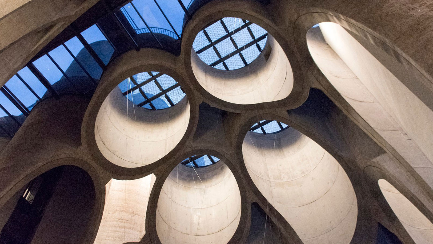
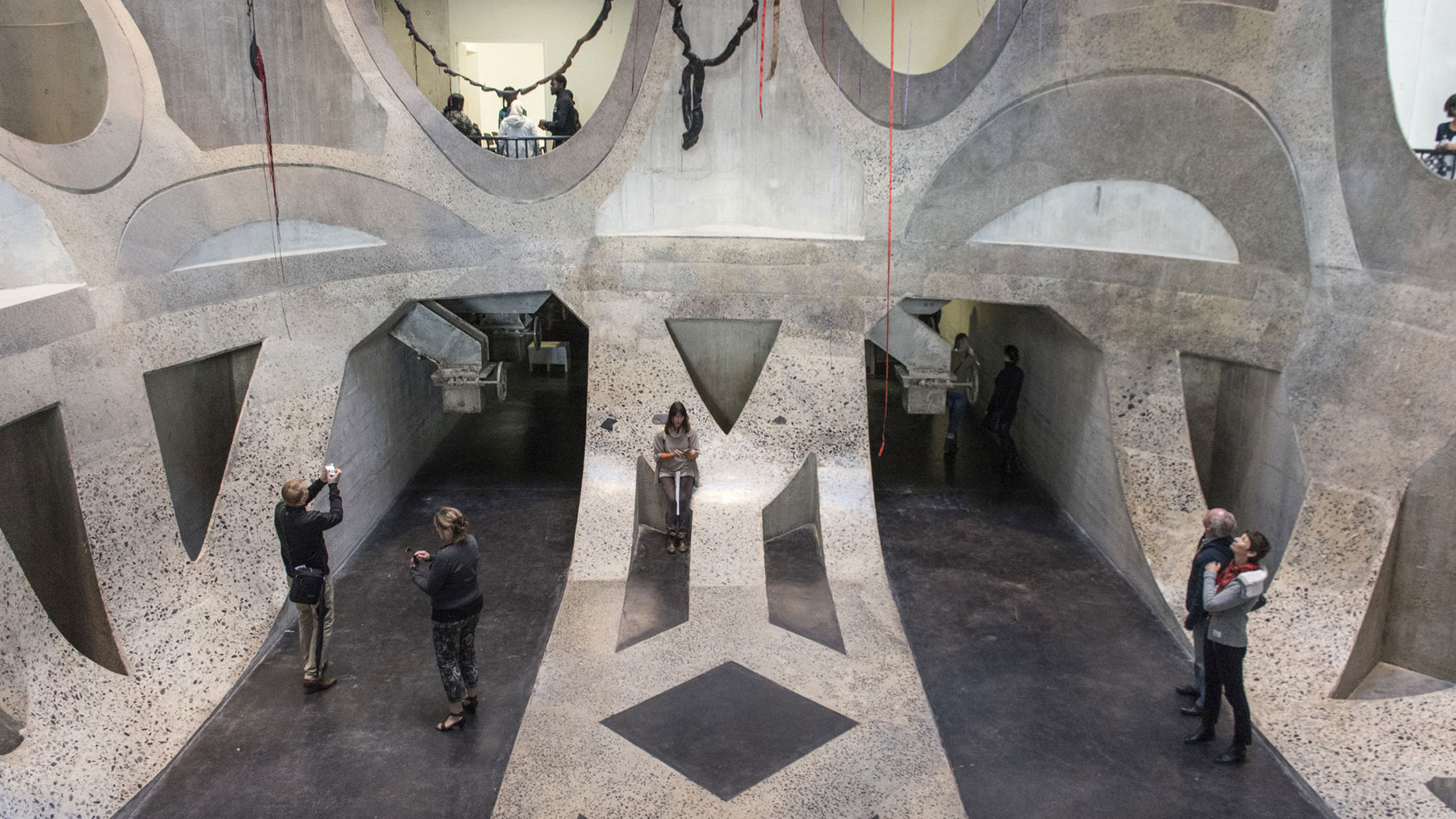
By repurposing the building’s 42 cellular grain silos, we were able create a distinct and memorable design that complements its new role as an art museum. One of the design’s defining features is the 30m tall atrium that has been carved out of the existing matrix of cylindrical silo bins. This unusual approach to the atrium’s construction gives visitors the sense of being inside a giant honeycomb, providing a unique experience that adds to their appreciation of the gallery’s artwork.
To realise this ambitious architectural vision, the team needed to remove a number of the building’s load-bearing parts while still maintaining its structural integrity. In response, our design approach included re-sleeving its cylindrical silos with a layer of reinforced concrete, without implementing any additional visible elements, to strengthen its remaining structure.
As a result of its striking, retrofit design, the Grain Silo has not only become one of Cape Town’s ‘must-see’ destinations, but also demonstrates the significant advantages of sustainable renovation. We prioritised re-use over newbuild wherever possible, minimising embodied carbon across the design, and the result is a globally relevant example of successful industrial adaptive reuse.
Skylights that delight and engage
Our team supported the architect by designing the Grain Silo’s distinct skylights. Anchored to steel frames that sit on top of the cut cylindrical silo bins, each skylight is made up of a series of laminated glass panels that can be safely walked on. These allow daylight to cascade into the building’s cathedral-like structure, illuminating the edges of its carved-out silos. This floods the central atrium with controlled natural light, creating a welcoming and dramatic space for visitors to enjoy. Complementing this, a specially commissioned artwork was featured within the skylight design. The shadow cast by this helps to moderate the harsh summer sun and, together with the specifically designed artificial lighting scheme, creates a gentle lighting transition between day and night.
Beyond illumination, the skylights also improve the visitor experience by providing different vantage points from which they can view the atrium. Forming part of the external sculpture garden, the skylights are designed to withstand the heavy loads caused by crowds and sculptures.
A glowing lantern at the harbour's edge
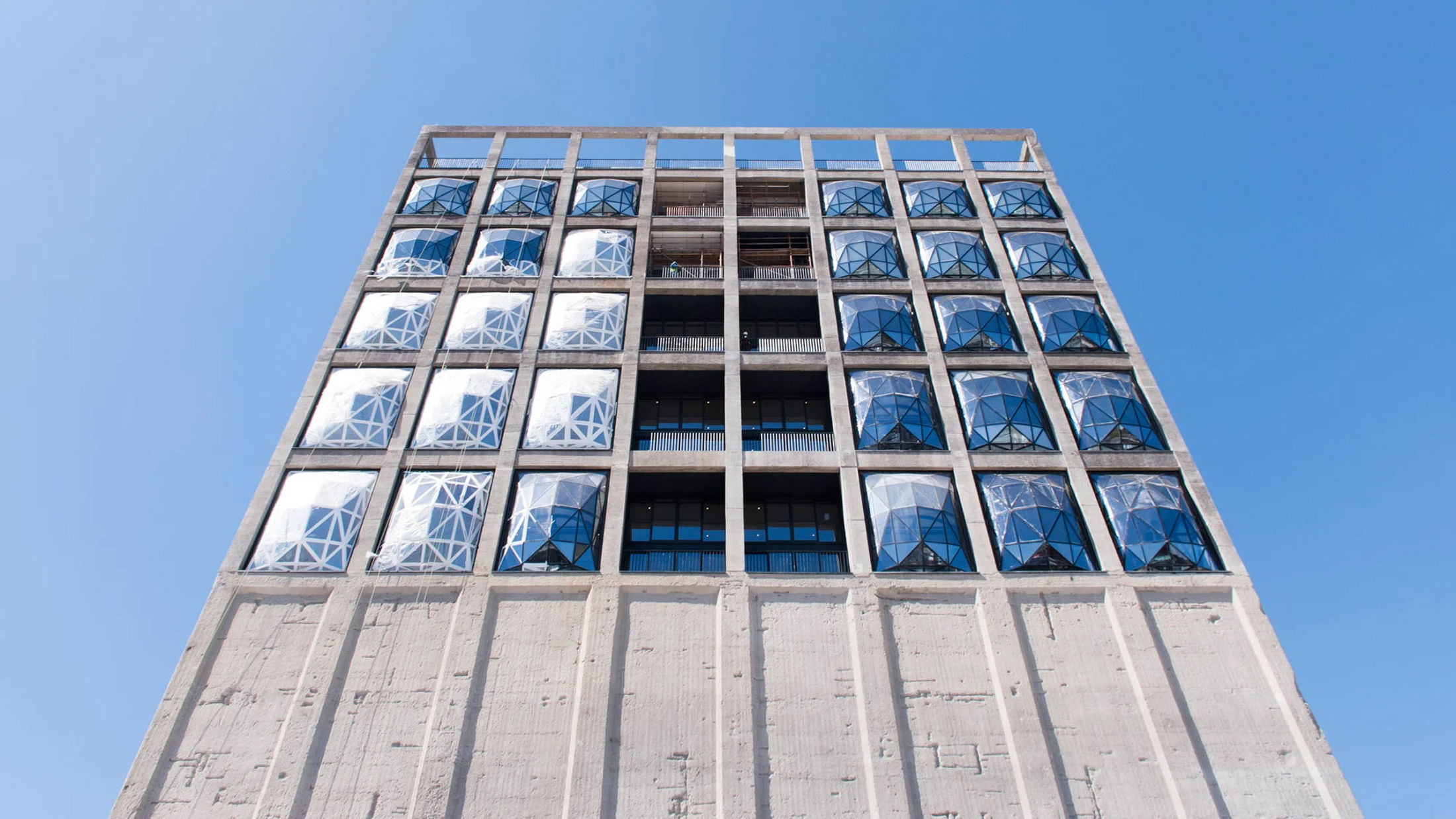
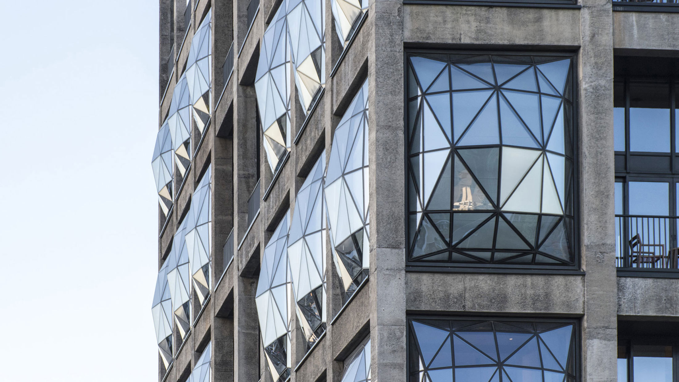
The most significant change to the building’s external appearance is the integration of its iconic convex façade panels – or ‘pillows’ – into its existing structure. When viewed from the outside during the day, the building’s triangular window panes mirror the sky to create a unique aesthetic. At night, lights within the building shine through these windows to give onlookers the impression of a glowing lantern in the sky.
This façade design benefits those situated inside the building. With their large, protruding shape, the pillows provide visitors with an abundance of natural daylight. They also perform several important technical functions. The convex shape of the steel framed pillows help to reduce peak energy loads when compared to a flat façade. This means that the hotel rooms do not get as hot, which in turn reduces the energy required to cool the spaces through air conditioning.
This challenging façade design was made possible by an advanced parametric model created by our team. We wrote all possible technical considerations into the model, allowing the architects to have full control over the final geometric solution, with each possible option already being pre-assessed for technical feasibility. This approach ensured that the complex design was developed swiftly and efficiently, and its level of detail – alongside a well thought through and pragmatic design – provided a sound basis for procurement to reduce costs and programme risks. Notably, this complex geometrical design was achieved using entirely South African expertise, both in design and fabrication.
Preserving priceless artworks
Although less noticeable than its distinct façade pillows, the building’s two-stage environmental control system was equally important to its success as a museum space. A single system works to naturally ventilate the atrium with purified outside air, while multiple systems work to condition the gallery – providing dedicated climate control for each gallery space that meets strict international museum standards. The galleries also make use of the innate thermal inertia of its exposed concrete walls. This helps to regulate the gallery’s temperature and humidity, slowing the rate of temperature change as visitors pass through.
With this approach to climate control, the building’s retrofit design not only conserves the Grain Silo’s rich heritage, but also preserves the priceless artwork that now sits within its historic walls.
Heatherwick Studio / Van Der Merwe Miszewski Architects / Rick Brown Associates & Jacobs Parker / WBHO
What we delivered
-
Using our retrofitting expertise, we were able to utilise the building's 42 grain silos to compliment the musuem
-
Brought to life the architect's vision of 'pillow' like facade elements, creating convex facade panels - resulting in a 'glowing lantern' on the harbour's edge
-
Used parametric modelling to consider the technical challenges of the facade - allowing the architects to have full control over the final geometric solution
Get in touch with our team
Projects
Explore more property projects

How can timber help to decarbonise housing construction in Africa?
Gatsby Africa, Kenya

Blending technology and artistry
Xi’an MixC, Mainland China

Technical design advice to ensure the functionality and viability of Dubai's new super slender skyscraper
Muraba Veil, United Arab Emirates
Designing Sydney’s first integrated station development
Sydney Metro Martin Place integrated station development, Australia
Get in touch with us
If you'd like to speak to one of our property experts about any of the issues raised on this page or a potential collaboration then please get in touch by completing the form.
